Keep up to date on current trends and technologies
HTML & CSS - HTML
How to Apply CSS3 Transforms to Background Images
Craig Buckler

Five Ways to Lazy Load Images for Better Website Performance
Maria Antonietta Perna

HTML5 Template: A Basic Boilerplate for Any Project
Louis LazarisDianne Pena

How to Create a Chrome Extension in 10 Minutes Flat
James Hibbard

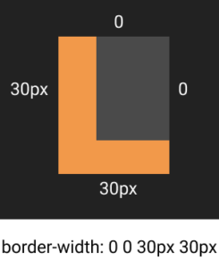
Four Simple Ways to Draw a Rectangle in HTML
Adam RobertsDianne Pena

15 Best HTML Books for Beginners and Advanced Coders
Lucero del Alba
6 Clever SVG Pattern Generators for Your Next UX Design
Alex Walker

7 of the Best Code Playgrounds & CodePen Alternatives
Craig Buckler

The Complete Guide to HTML Forms and Constraint Validation
Craig Buckler

ngrok Step-by-Step Guide: Easily Share Your Local Server
Craig Buckler

Canvas vs SVG: Choosing the Right Tool for the Job
Maria Antonietta Perna

How to Add Scalable Vector Graphics to Your Web Page
Craig Buckler

How to Draw Cubic Bézier Curves on HTML5 SVGs
Craig Buckler

How to Draw Quadratic Bézier Curves on HTML5 SVGs
Craig Buckler

How to Translate from DOM to SVG Coordinates and Back Again
Craig Buckler

CSS with SVG: Real World Usage
Craig Buckler

Scalable Vector Graphics: Drawing Basics
Craig Buckler

How to Edit Source Files Directly in Chrome
Craig Buckler
Code Challenge #2: 4 Tips for Higher Scores in CSSBattle.dev
Alex Walker
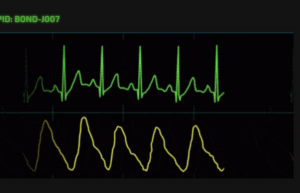
UI Code Challenge #1 – Heartbeats
Alex Walker

A Guide to the Pug HTML Template Preprocessor
James Hibbard

Build a Simple Tumblr Theme with Bootstrap
Ashraff Hathibelagal

A Full-screen Bootstrap Carousel with Random Initial Image
George Martsoukos

Bootstrap: Super Smart Features to Win You Over
Maria Antonietta Perna

Front-end Frameworks: Custom vs Ready-to-use Solutions
Ivaylo Gerchev

Understanding Bootstrap Modals
Syed Fazle Rahman

Why I Love Bootstrap, and Why You Should Too
Syed Fazle Rahman

How to Create Beautiful HTML & CSS Presentations with WebSlides
Ivaylo Gerchev

Frame by Frame Animation Tutorial with CSS and JavaScript
Michael Romanov
Replaced Elements in HTML: Myths and Realities
Adrian Sandu

Building Mega Menus with Flexbox
Kalpesh Singh
How I Built a Pure CSS Crossword Puzzle
Adrian Roworth
Showing 32 of 361