
Description
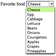
The select form control is a container for a series of option elements that display in the browser as a pull-down menu (that is, a drop-down list). Unless you use the multiple attribute, the control will allow the user to pick just one item from the list of options that’s generated by the contents of the nested option elements. The select renders slightly differently depending on the browser and operating system in use, and is well known as a troublesome HTML element to style with CSS (because the display is inherited from the operating system, rather than provided by the browser). If there isn’t enough room on the page for the list to display below the control, it will open up above it. The below image shows and expanded select list in Firefox.
Example
This example shows a
very simple select element:
<form>
  <label for="favoritefood">Favorite food</label>
  <select name="favoritefood" id="favoritefood">
    <option>Cheese</option>
    <option>Egg</option>
    <option>Cabbage</option>
    ⋮
  </select>
</form>
Use This For…
This element is used to allow visitors to make selections from a long list of items. The alternative approach would involve the use of radio input selections, but this would require all the options to be displayed on the page at once; select controls generally display in a smaller amount of page real estate.
Frequently Asked Questions (FAQs) about HTML Select Element
How can I use the HTML select element to create a dropdown list?
The HTML select element is used to create a dropdown list in HTML. To create a dropdown list, you need to use the select element in combination with the option element. The select element defines the list, while the option elements define the available options in the list. Here is a simple example:<select>
<option value="volvo">Volvo</option>
<option value="saab">Saab</option>
<option value="mercedes">Mercedes</option>
<option value="audi">Audi</option></select>
In this example, the select element creates a dropdown list with four options: Volvo, Saab, Mercedes, and Audi. The value attribute in the option element defines the value to be sent to the server when the form is submitted.
How can I set a default option in the HTML select element?
To set a default option in the HTML select element, you can use the selected attribute in the option element. The selected attribute specifies that an option should be pre-selected when the page loads. Here is an example:<select>
<option value="volvo">Volvo</option>
<option value="saab">Saab</option>
<option value="mercedes" selected>Mercedes</option>
<option value="audi">Audi</option></select>
In this example, the Mercedes option will be pre-selected when the page loads.
Can I group related options in a dropdown list?
Yes, you can group related options in a dropdown list using the optgroup element. The optgroup element is used to group related options in a dropdown list. Here is an example:<select>
<optgroup label="Swedish Cars">
<option value="volvo">Volvo</option>
<option value="saab">Saab</option>
</optgroup>
<optgroup label="German Cars">
<option value="mercedes">Mercedes</option>
<option value="audi">Audi</option>
</optgroup></select>
In this example, the options are grouped into two groups: Swedish Cars and German Cars.
How can I make multiple selections in a dropdown list?
To allow multiple selections in a dropdown list, you can use the multiple attribute in the select element. The multiple attribute allows the user to select more than one option from the dropdown list. Here is an example:<select multiple>
<option value="volvo">Volvo</option>
<option value="saab">Saab</option>
<option value="mercedes">Mercedes</option>
<option value="audi">Audi</option></select>
In this example, the user can select more than one option from the dropdown list.
How can I disable an option in a dropdown list?
To disable an option in a dropdown list, you can use the disabled attribute in the option element. The disabled attribute specifies that an option should be disabled and not selectable. Here is an example:<select>
<option value="volvo">Volvo</option>
<option value="saab">Saab</option>
<option value="mercedes" disabled>Mercedes</option>
<option value="audi">Audi</option></select>
In this example, the Mercedes option is disabled and not selectable.
How can I use the HTML select element in a form?
The HTML select element is often used in a form to collect user input. The select element, along with the option elements, is wrapped inside a form element. When the form is submitted, the selected option’s value is sent to the server. Here is an example:<form action="/submit_form" method="post">
<select name="car">
<option value="volvo">Volvo</option>
<option value="saab">Saab</option>
<option value="mercedes">Mercedes</option>
<option value="audi">Audi</option>
</select>
<input type="submit" value="Submit"></form>
In this example, when the form is submitted, the value of the selected option is sent to the server.
How can I style the HTML select element with CSS?
You can style the HTML select element with CSS just like any other HTML element. You can change the background color, font size, font color, border, and more. Here is an example:<select style="background-color: yellow; color: black; border: 1px solid black;">
<option value="volvo">Volvo</option>
<option value="saab">Saab</option>
<option value="mercedes">Mercedes</option>
<option value="audi">Audi</option></select>
In this example, the background color of the dropdown list is set to yellow, the font color is set to black, and the border is set to 1px solid black.
Can I use the HTML select element without a form?
Yes, you can use the HTML select element without a form. However, without a form, the selected option’s value will not be sent to a server when the user makes a selection. The select element can still be useful without a form for creating a dropdown list for navigation or for other interactive features on a webpage.
How can I handle the change event of the HTML select element with JavaScript?
You can handle the change event of the HTML select element with JavaScript using the onchange event attribute. The onchange event is fired when the selected option of the select element is changed. Here is an example:<select onchange="handleSelectChange(event)">
<option value="volvo">Volvo</option>
<option value="saab">Saab</option>
<option value="mercedes">Mercedes</option>
<option value="audi">Audi</option></select><script>function handleSelectChange(event) {
console.log(event.target.value);}</script>
In this example, when the selected option is changed, the handleSelectChange function is called, and the value of the selected option is logged to the console.
Can I use the HTML select element with other form elements?
Yes, you can use the HTML select element with other form elements like input, textarea, button, etc. The select element can be a part of a complex form with various types of input from the user. When the form is submitted, the values of all the form elements are sent to the server.
Adam is SitePoint's head of newsletters, who mainly writes Versioning, a daily newsletter covering everything new and interesting in the world of web development. He has a beard and will talk to you about beer and Star Wars, if you let him.


Published in
·Design·Design & UX·Illustration·Photography & Imagery·Resources·Review·Software·September 29, 2014