
Key Takeaways
- Tables in HTML are complex, containing elements like captions, row groups, and column groups. These are rendered in a specific bottom-up order: table, column groups, columns, row groups, rows, and cells. The table model in HTML is row-centric, with cells structurally contained within rows.
- Ten valid values for the display property denote table-related formatting styles. These can be applied to other element types, but may require the generation of anonymous table-related elements to render correctly.
- The width of a table and its columns can be determined by two different algorithms: the fixed table layout algorithm and the automatic table layout algorithm. The former is not governed by the contents of the table’s cells, while the latter requires examination of every cell in the table, which can be time-consuming for larger tables.
- There are two different models in CSS2 for rendering borders around internal table objects: the separated borders model and the collapsing borders model. The separated borders model allows only cells and the table itself to have borders, while the collapsing borders model allows borders of rows, row groups, columns, column groups, and the table itself to overlap in a complex manner.
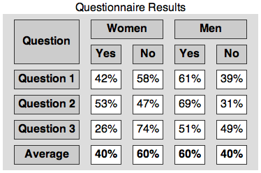
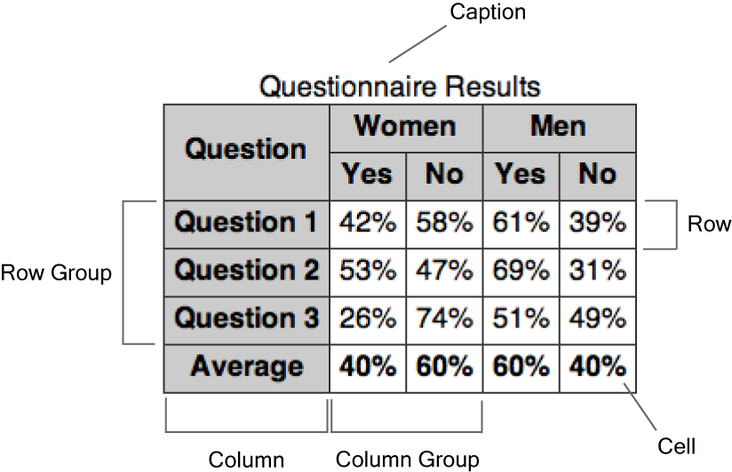
Tables are the most complex elements in HTML, and table formatting is among the most complex parts of CSS. CSS defines a number of objects that are involved in table formatting, as the below image reveals.

A table may contain a caption, row groups, and column groups. A row group contains rows, while a column group contains columns. Rows and columns contain cells. Tables are rendered as layers in a specified order from the bottom up: table, column groups, columns, row groups, rows, and cells.
The table model in HTML is row-centric. Although you can specify columns and column groups in markup, cells are structurally contained within rows. Columns and column groups are more esoteric items that are derived from the set of cells in all rows of the table.
A table can be included in a formatting context as either a block-level or inline-level box. It can have padding, borders, and margins.
A table element generates an anonymous box that encompasses the table box and the caption box (if they’re present). The caption box is rendered outside the table box, but is inextricably tied to it. When a table is repositioned, it’s the outer anonymous box that’s moved to enable the caption to follow the table.
Captions inherit inheritable properties from the table. A caption is formatted as a block box, but it doesn’t behave like general block boxes in all respects. If a run-in element precedes the table, it will not run into a caption box.
The placement of the caption can be controlled via the caption-side property. The valid values in CSS2.1 are top and bottom, which should be fairly self-explanatory.
The internal elements of tables—row groups, column groups, rows, columns, and cells—generate regular boxes that can have borders. Cells can also have padding, but internal table objects don’t have margins.
Ten of the valid values for the display property denote table-related formatting styles. These values, and the HTML element types with which they’re associated by default, are shown in the below table.
| Element Type | Property Value | HTML Element |
|---|---|---|
| Table | table |
table |
inline-table |
n/a | |
| Caption | table-caption |
caption |
| Row group | table-header-group |
thead |
table-footer-group |
tfoot |
|
table-row-group |
tbody |
|
| Row | table-row |
tr |
| Column group | table-column-group |
colgroup |
| Column | table-column |
col |
| Cell | table-cell |
td |
th |
These display values can also be specified for other element types than those that belong to the HTML table model; however, Internet Explorer versions up to and including 7 don’t support these values.
When table-related display values are used for non-table elements, anonymous table-related elements may have to be generated in order to render the elements correctly. Here, we’ve listed situations in which anonymous table-related elements may be created:
- Cells must have a row as their parent. A row object will be
generated as the parent of one or more consecutive cells that don’t have
a row as their parent. - Rows must have a row group or a table as their parent. Columns must
have a column group or a table as their parent. Row groups and column
groups must have a table as their parent. A table object will be
generated as the parent of one or more consecutive objects of those
types that don’t have the required parent. - If a child of a table object is not a caption, row group, column
group, row, or column, a row object will be generated as the parent of
that child, and any consecutive siblings that require a row as their
parent. - If a child of a row group object isn’t a row, a row object will be
generated as the parent of that child and any consecutive siblings that
require a row as their parent. - If a child of a row object is not a cell, a cell object will be
generated as the parent of that child and any consecutive siblings that
are not cells.
Properties that Apply to Column and Column-group Elements
Only a few properties can be applied to elements with a display property value of table-column or table-column-group:
- the
borderproperties, but only in the
collapsing borders model (see below) - the
backgroundproperties, where cells and rows
have transparent backgrounds - the
widthproperty - the
visibilityproperty value
collapse—any other visibility values are ignored
for columns and column groups
Table Width Algorithms
Unlike other block boxes, a table with zero horizontal margins and a width property that’s set to auto doesn’t size to fill its containing block. Instead, the table size will be determined by its contents. A table can be horizontally centered by setting margin-left and margin-right to auto, though.
There are two very different algorithms for determining the widths of table columns: the fixed table layout algorithm and the automatic table layout algorithm. These are specified with the table-layout property (which takes values of fixed, for fixed layouts, and auto, for automatic layouts); its initial value is auto. If the table’s width is specified as auto, the automatic table layout algorithm is normally used. In the case of block-level tables (when display is set to table), user agents are allowed to use the fixed table layout algorithm anyway, but they aren’t required to.
With the fixed table layout algorithm, the widths of columns and of the table are not governed by the contents of the table’s cells. Instead, the width of each column is determined as follows:
- Column objects whose
widthis not
autoset the width for that column. - A cell in the first row, whose
widthis not
auto, sets the width of the column it belongs to.
If the cell spans more than one column, the width is divided over the
columns. - Any remaining columns equally divide the remaining horizontal
space, minus any borders or cell spacing.
The width of the table is the greater of the value of the table’s width property, and the sum of the column widths (plus borders or cell spacing). If the table is wider than the columns, the extra space will be distributed over the columns.
Don’t Omit Cells!
Since the cells in the first row of the table are used to determine the column widths, you shouldn’t omit any cells from the first row if you use the fixed table layout algorithm. The behavior in such case is undefined by the CSS2.1 specification.
The automatic table layout algorithm usually requires more than one pass. The CSS2.1 specification suggests an algorithm for determining column widths, but user agents are not required to use it.
The suggested algorithm for determining column widths examines every cell in the entire table, computing the minimum and maximum widths required for rendering each cell. These values are then used to determine how wide each column should be, which in turn may decide the width of the table itself.
Performance and Automatic Table Layouts
Since every single cell must be inspected, the automatic table layout algorithm can become very time-consuming when it’s calculated for a table with a large number of rows and/or columns.
Table Height Algorithms
If the table’s height property has a value other than auto, and the specified height differs from the sum of the row heights plus borders or cell spacing, the behavior is undefined.
Percentage values for the height property are undefined for rows, row groups, and cells.
The vertical-align property of each cell determines its alignment within the row. Only the values baseline, top, bottom, and middle are allowed. For any other value, baseline will be used.
Borders On Table Objects
There are two different models in CSS2 for rendering borders around internal table objects: the separated borders model and the collapsing borders model. We can choose the model we prefer by using the border-collapse property, and setting the value to separate (the initial value) or collapse.
In the separated borders model only cells (and the table itself) can have borders; rows, row groups, columns, and column groups cannot. Borders are drawn individually around the cells and the cells are separated by the vertical and horizontal distances specified by the border-spacing property. In the space between cell borders, the backgrounds of rows, row groups, columns, and column groups are invisible. Only the table background is visible in the inter-cell spacing. The below image shows an example of a table that’s rendered using the separated borders model.
Here’s the relevant CSS for the table:
table {
  border-collapse: separate;
  border-spacing: 1em 0.5em;
  background-color: #ddd;
}
Another property that applies in the separated borders model is the empty-cells property. It controls whether cells that lack visible content have borders and backgrounds (if the value is show, the initial value) or not (if the value is hide). Carriage returns, line feeds, tabs, and blanks are not considered to be visible content, although a non-breaking space is.
In the collapsing borders model, the cells aren’t separated from one another and their borders—along with borders of rows, row groups, columns, column groups and the table itself—collapse (or overlap) in a rather complicated way. An example of a table to which the collapsing borders model is applied is shown here:
With this model, quite a few borders may be specified in such a way that they would be rendered in the same place. The CSS2.1 specification provides an algorithm for border conflict resolution—that is, which border will win, or be rendered, in these situations. Very broadly speaking, the most eye-catching border will be rendered, unless at least one of the borders has border-style set to hidden, in which case no border will be rendered.
If none of the borders are hidden, wide borders win over narrow borders. If two or more borders have the same width, the border-style property decides which one will be rendered. The styles are preferred in the following order: double, solid, dashed, dotted, ridge, outset, groove, and inset. Borders with border-style set to none have the lowest priority, and will never win over other border styles—even if they have a large width value.
If there is still no winner, the algorithm looks at the objects for which the borders are set. The preferred order is: cell, row, row group, column, column group, and table.
The border-spacing and empty-cells properties are ignored when the collapsing borders model is used.
Frequently Asked Questions (FAQs) about Table Formatting
What are the basic steps to format a table in HTML?
Formatting a table in HTML involves several steps. First, you need to create the table using the tag. Inside this tag, you can use the tag to create rows and the
| tag to create cells or columns. To apply styles to your table, you can use CSS. This can be done inline, in the head section of your HTML document, or in an external CSS file. You can change the background color, border style, padding, text alignment, and more using CSS properties. |
How can I make my table responsive?
To make your table responsive, you can use CSS media queries. These allow you to apply different styles depending on the size of the user’s screen. For example, you can make the table display as a block element and give it a max-width of 100% when the screen size is below a certain threshold. This will make the table scroll horizontally on small screens.
How can I merge cells in a table?
Merging cells in a table can be done using the colspan and rowspan attributes in HTML. The colspan attribute allows you to merge cells horizontally, while the rowspan attribute allows you to merge cells vertically. For example, would merge two cells horizontally.
How can I add a border to my table?
Adding a border to your table can be done using the border property in CSS. For example, you can use border: 1px solid black; to add a 1px solid black border to your table. You can also use the border-spacing property to control the space between the borders of adjacent cells.
How can I change the background color of my table?
Changing the background color of your table can be done using the background-color property in CSS. For example, you can use background-color: blue; to change the background color of your table to blue. You can also use this property on the and tags to change the background color of individual rows or cells.
How can I align text in my table?
Aligning text in your table can be done using the text-align property in CSS. For example, you can use text-align: center; to center the text in your table. You can also use this property on the and tags to align the text in individual rows or cells.
How can I add a caption to my table?
Adding a caption to your table can be done using the tag in HTML. This tag should be placed immediately after the tag. The text inside the
How can I style the first row or column of my table differently?
Styling the first row or column of your table differently can be done using the :first-child pseudo-class in CSS. For example, you can use tr:first-child to select the first row of your table, or td:first-child to select the first cell in each row.
How can I add a hover effect to my table?
Adding a hover effect to your table can be done using the :hover pseudo-class in CSS. For example, you can use tr:hover to change the background color of a row when the user hovers over it.
How can I make my table accessible?
Making your table accessible can be done by using semantic HTML and adding appropriate ARIA roles. For example, you can use the tag to mark header cells, and the scope attribute to specify whether they apply to rows or columns. You can also use the tag to provide a description of the table, and the summary attribute to provide additional information about the table’s structure.
Adam is SitePoint's head of newsletters, who mainly writes Versioning, a daily newsletter covering everything new and interesting in the world of web development. He has a beard and will talk to you about beer and Star Wars, if you let him.

Published in
·APIs·CMS & Frameworks·Debugging & Deployment·Miscellaneous·Patterns & Practices·PHP·Programming·Web·August 4, 2014
Published in
·automation·Design Patterns·Laravel·Libraries·Miscellaneous·Patterns & Practices·PHP·Testing·December 14, 2015