How to Set CSS Margins and Padding, and Cool Layout Tricks


In this tutorial, you’ll learn the difference between CSS margins and padding and how these properties affect the space between elements on a web page. We’ll also discuss margin collapsing, the effect of using different units while creating responsive websites, and conclude with some layout tricks you can do with CSS margins and padding.
Key Takeaways
- Understanding the CSS Box Model is crucial as elements in CSS are represented as a rectangular box, the size of which is determined by the element’s content, padding, border, and margin.
- Box sizing is a common stumbling block for CSS beginners. The default setting of ‘box-sizing: content-box’ means padding and borders are added to the width and height set for an element, often causing confusion. A common solution is to set boxes to ‘box-sizing: border-box’.
- CSS allows control over the padding and margin applied to the four sides of an element. Padding surrounds the element’s content, while margin is the external layer, creating space between the element and its surrounding elements.
- Interesting uses of margins and padding include centering elements within their parents, using margin to space elements apart, and maintaining image aspect ratios. Understanding these techniques can help solve a number of layout-related issues.
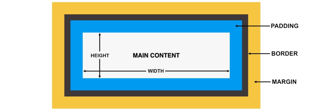
Understanding the CSS Box Model
Elements in CSS are represented as a rectangular box. The size of this rectangular box is determined by the element’s:
- content
- padding
- border
- margin
The content area of an element lies in the middle of the element. The padding surrounds the element’s content. The borders surround the padding. The margin of the element is its external layer: that is, it lies outside the element.
The following diagram should make the arrangement clearer.
Understanding CSS Box Sizing
Box sizing is one of the first things to trip up CSS beginners. It’s common to see two elements sitting side by side, and it’s natural to expect that, if they both have a width of 50%, they should be able to fit within their container. But it’s confusing when they don’t.
By default, if we set a width on an element and then add padding and/or borders left or right, the overall width of the element grows. That is, any padding or border is added to the overall width of the element. So if our width: 50% elements also have left/right padding and/or border, they are wider than 50%.
The W3C box model defaults to as setting of box-sizing: content-box. This means that padding and borders are added to the width and height we’ve set for an element. Generally speaking, this default makes page layout quite difficult, as we have to think about more than just the width we set for elements.
It’s often much more convenient to set a width on an element and know that any padding and border we set on the element will be included in that width measurement. To ensure this is the case, we can set our boxes to box-sizing: border-box. That way, we don’t have to worry about our elements getting too big for their layout.
It’s not uncommon to see CSS resets applying border-box to all elements:
html {
  box-sizing: border-box;
}
*, *:before, *:after {
  box-sizing: inherit;
}
Note: there are simpler resets than this, but this one makes it easier to change your mind if you do want an element to have a different box sizing.
You can read more about box sizing on MDN or in the box-sizing specification.
If you learn best by doing, try experimenting with this fun interactive demo by Guy Routledge.
How to Set Padding in CSS
We can control the padding applied to the four sides of an element using the padding-top, padding-right, padding-bottom and padding-left properties. We can also specify the padding using the shorthand padding property.
When a single padding value is present, CSS uses this value to determine the padding of all four sides:
/* all four sides */
padding: 20px;
When two values are present, the first value determines the top and bottom padding and the second value determines the left and right padding:
/* vertical | horizontal */
padding: 2em 4em;
When three values are present, the first value determines the top padding, the second value determines the left and right padding and the third value determines the bottom padding:
/* top | horizontal | bottom */
padding: 1em 20px 2em;
When all four values are present, they set the top, right, bottom and left padding in this exact order:
/* top | right | bottom | left */
padding: 10px 10% 2em 15%;
The padding examples above are shown in the following CodePen demo. Each box has a blue background and a white border.
All elements in the demo above are set to box-sizing: border-box. If you comment out that setting in the Pen above, you’ll see the boxes get bigger, since the padding is added to the overall width and height of the boxes.
How to Set Margin in CSS
Just like with padding, we can control the margin applied to the four sides of an element using the margin-top, margin-right, margin-bottom and margin-left properties. We can also specify the margin for all the four sides of an element using the shorthand margin property:
/* all four sides */
margin: 10px;

/* vertical | horizontal */
margin: 2em 4em;

/* top | horizontal | bottom */
margin: 2em auto 2em;

/* top | right | bottom | left */
margin: 10px 10% 2em 15%;
Margins serve to create space between elements. In the demo below, each box is floated left and the first two have a margin-right value.
Things to Keep in Mind about Margin and Padding
Let’s look at some useful things to keep in mind when using margin and padding.
Using the right units
When applying margins and padding, think carefully about whether or not you want to use absolute units (such as pixels). This is because these units won’t adapt to the changes in font size or screen width.
Let’s say you have set the width of an element to 50% and also applied a margin of 15px on it. At 1200px, its width would be 600px and its margin would be 15px. At 769px, its width would be 384px and its margin would still be 15px.
In this case, the width of the element has changed by 36% but its margin still has the same old value. In most cases, this might not be a big deal. However, setting the element’s margin in terms of percentages will allow you to have finer control over the layout of the webpage on all screen sizes. This way you can make everything proportional without any sudden jumps in the value of applied margins and padding.
Similarly, you may want to add padding to text elements on a web page. Generally, you would like the padding to be proportional to the font size of the corresponding element. This can’t be achieved with absolute units. However, if the padding is specified in terms of em units, it will automatically scale with the font size. Here is a demo that shows this scaling in action.
How browsers compute margin and padding values for different units
Browsers compute the final margin and padding values for an element differently based on the unit being used.
Any margin or padding that has been specified as a percentage is calculated based on the width of the containing element. This means that padding of 5% will be equal to 5px when the parent element is 100px wide, and it will be equal to 50px when the parent element is 1000px wide. Remember that the top and bottom values are also calculated based on the width of the parent element.
In case of em units, the computed value for margin and padding is based on the font size of the element. In the previous CodePen demo, the padding applied to the bottom three text elements is 1em. However, the computed value of padding is different in each case because of the different font size.
There are also four different viewport based units called vw, vh, vmin and vmax. The computed value of margin and padding in this case is based on the viewport. For example, a padding of 5vw will be equal to 25px when the viewport is 500px wide and a padding of 10vw will be equal to 50px for the same viewport width. You can read more about these units in CSS Viewport Units: A Quick Start on SitePoint.
As a beginner, knowing how these different units work can help you quickly figure out why the padding or margin of HTML elements is changing based on the parent element’s size, font size or even the viewport, which gives you the power to take control of your layout.
Dealing with collapsing margins
Another concept that you should be aware of is collapsing margins. In certain situations, the top and bottom margins on two elements can collapse into one. This phenomenon is called margin collapsing.
Let’s say you have two elements side by side — that is, adjacent siblings. If the margin-bottom property on the first element is set to 40px and the margin-top property on the second element is set to 25px, the final margin between the two elements will not be 65px. Its actual value will be equal to the value of the bigger margin — that is, 40px.
Similarly, margins can also collapse between a parent element and its first/last child. This happens when there is no border, padding or inline content to separate the child’s and parent’s respective margins. In this case, if there’s no padding or border on the parent element, the child’s margin will look as if it were bleeding out of the parent.
One way to avoid this situation is to add a barrier between the parent’s margin and the child’s. This can be done by either using a border or a padding. The following demo shows how adding a border or padding on the parent element can avoid the bleeding margin.
In case of negative margins, the final value of the collapsed margins is the sum of the largest positive margin and the smallest negative margin.
You can read more on this topic in Collapsing Margins, by Adam Roberts.
Interesting Uses of Margins and Padding
Sometimes, you can use CSS margin and padding properties to solve a number of layout related issues. Here are a few examples.
Center elements within their parents
Centering block-level elements horizontally inside their parent is very easy with the help of the margin property. All you have to do is set the value of the margin-left and margin-right properties of the element to auto:
.child {
  margin: 10px auto;
}
In the following demo, you can see three instances of a parent element: the first one is set to be a block-level element, the second one to be an inline-block element, and the third one is a block-level element that has been floated to the right. The child element results to be centered horizontally in all cases.
Using margin to space elements apart
A super cool (but often little-known) use of margins is to isolate elements from one another using margins. This is incredibly handy in many scenarios, such as when laying out Flexbox items. Take a look at the examples in the following CodePen demo.
In each case, we’re pushing one box away from the others using margin. This can be done with vertical spacing as well.
For more margin tips like this, check out Kevin Powell’s video on more amazing things you can do with auto margins.
Maintaining image aspect ratios
Often, the images on a web page do not have a fixed aspect ratio. If you have to show all images with the same aspect ratio, CSS padding can help.
The trick is to set the height of the parent element to zero and its padding-top property to be equal to the value of the desired aspect ratio expressed as a percentage.
For example, an aspect ratio of 16:9 can be achieved by using padding: 56.25% 0 0 0. Here, the value 56.25 was obtained after calculating (9/16)*100. The same method can be used to calculate the percentage of padding for any other aspect ratio.
You can read more about this technique on How to Maintain Image Aspect Ratios in Responsive Web Design, by Craig Buckler. You can also read about newer ways to maintain aspect-ratio in our article on the new CSS aspect-ratio property.
Other interesting (though a bit more advanced) uses of margins and padding, include creating full-width containers inside limited width parents and adding consistent spacing at the bottom of different modules in a web page. You can consider these to be your next steps in mastering CSS margins and padding.
Conclusion
If you are new to CSS, we hope this tutorial has helped you understand the differences between margins and padding. You should also be comfortable setting margins and padding with the shorthand syntax and appropriate units. In the last section, we mentioned a few interesting layout-related uses of these properties and pointed you to further resources to find out more.
Take your CSS skills to the next level with our book CSS Master, 3rd Edition by Tiffany B. Brown – covering CSS animations, transitions, transformations and much more.
FAQs About CSS Margins and Padding
Margin: It is the space outside the border of an element, creating space between the element and its surrounding elements.
Padding: It is the space inside the border of an element, creating space between the element’s content and its border.
Use the margin and padding properties in CSS, followed by values such as pixels, percentages, em, or rem. For example, margin: 10px; or padding: 20%.
The shorthand property for setting margins is margin. You can specify values for the top, right, bottom, and left margins in one declaration. For example, margin: 10px 20px 15px 5px; sets top, right, bottom, and left margins respectively.
Yes, you can use negative values for both margins and padding. Negative margins can be used to overlap elements, while negative padding can be used to bring content closer to the element’s border.
auto value work for margins in CSS? When the margin property is set to auto, the browser automatically calculates the margin to evenly distribute the space around the element. This is often used for centering block-level elements horizontally.
Yes, percentage values can be used for both margins and padding. When a percentage value is used, it is calculated relative to the width of the containing element.
Baljeet is a writer and web developer based in India. Although he is a full-stack developer, he is most passionate about things related to the front-end. He has been involved with web development for more than five years now.
Dianne is SitePoint's newsletter editor. She especiallly loves learning about JavaScript, CSS and frontend technologies.

Published in
·CSS·Design·Design & UX·HTML & CSS·Resources·Typography·UI Design·Web Fonts·June 9, 2016