While CSS1 didn’t have much to offer for the graphical layout of documents, CSS2 has introduced several new properties for layout, and CSS3 will probably add even more. Although CSS still doesn’t provide total control over the page layout, it’s far more powerful than the old-school technique of using layout tables and presentational markup.
A web browser typically reads and renders HTML documents. This happens in two phases: the parsing phase and the rendering phase.
During the parsing phase, the browser reads the markup in the document, breaks it down into components, and builds a document object model (DOM) tree.
Consider this example HTML document:
<!DOCTYPE html PUBLIC "-//W3C//DTD HTML 4.01//EN"
    "https://www.w3.org/TR/html4/strict.dtd">
<html>
  <head>
    <title>Widgets</title>
  </head>
  <body>
    <h1>Widgets</h1>
    <p>Welcome to Widgets, the number one company
    in the world for selling widgets!</p>
  </body>
</html>
The above HTML document can be visualized as the DOM tree in the graph below (in which the text nodes have been omitted for clarity).
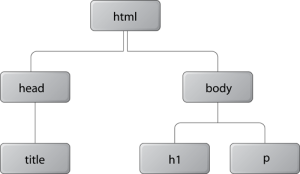
Each object in the DOM tree is called a node. There are several types of nodes, including element nodes and text nodes. At the top of the tree is a document node, which contains an element node called the root node; this is always the html element in HTML and XHTML documents, and it branches into two child element nodes—head and body—which then branch into other children.
A child node is structurally subordinate to its parent node. In HTML terms, this means that the child’s tags are nested inside the tags of the parent. For example, we can see in the above graph that the h1 element is a child node of the body element and the body element is the parent node of the h1 element. A node can be called a descendant node if it’s a child, grandchild, and so on, of another node. A node can be called an ancestor node if it’s a parent, grandparent, and so on, of another node. For example, the h1 element is a descendant node of the html element, and the html element is an ancestor node of the h1 element. Nodes that have the same parent are called siblings. The h1 and p elements are sibling nodes.
When the DOM tree has been constructed, and any CSS style sheets have been loaded and parsed, the browser starts the rendering phase. Each node in the DOM tree will be rendered as zero or more boxes.
Just as there are block-level elements and inline elements in HTML, there are block boxes and inline boxes in CSS. In fact, there are several other box types, but they can be seen as subtypes of the block and inline boxes.
A CSS box is always rectangular. It has four sides with a 90° angle between each of them.
From a somewhat simplified perspective, we can say that it’s the user agent style sheet which specifies that block-level HTML elements generate block boxes, while inline-level HTML elements generate inline boxes. We can, of course, use the display property to change the type of the box generated for any element.
CSS does not, however, affect the markup in any way. The separation into block-level and inline elements in HTML is specified in the HTML document type definition, and cannot be changed. For example, setting the display property to block for a span element doesn’t allow us to nest an h1 element inside it, because the HTML document type definition forbids it.
In this Section
Frequently Asked Questions about CSS Layout and Formatting
What is the difference between CSS layout and formatting?
CSS layout and formatting are two fundamental aspects of web design. The layout refers to the arrangement of elements on a webpage, such as headers, footers, and sidebars. It involves positioning these elements and defining their size and alignment. On the other hand, formatting refers to the appearance of these elements. It includes aspects like color, font, background, borders, and spacing. While layout focuses on the structure of a webpage, formatting is about the visual aesthetics.
How can I create a responsive CSS layout?
Creating a responsive CSS layout involves using media queries, flexible grid-based layouts, and flexible images and media. Media queries allow you to apply different styles for different devices based on screen size, resolution, and orientation. Flexible grid-based layouts use percentages instead of fixed units to size elements, allowing the layout to adjust to the screen size. Flexible images and media are sized in relative units to prevent them from displaying outside their containing element.
What are the different CSS layout models?
There are several CSS layout models, including the block model, inline model, table model, positioned model, and flex model. The block model is used for layout in blocks, the inline model for text, the table model for data arranged in rows and columns, the positioned model for explicit positioning, and the flex model for flexible box layouts.
How can I use CSS for formatting text?
CSS provides a wide range of properties for formatting text. These include font properties (like font-family, font-size, font-weight), text properties (like text-align, text-decoration, text-transform), and color properties. By using these properties, you can control the appearance of text on your webpage.
What is the box model in CSS layout?
The box model is a fundamental concept in CSS layout. It describes how space is distributed around elements. Each element is represented as a rectangular box, with the box’s content, padding, border, and margin built up around each other in layers. Understanding the box model is crucial for controlling layout and alignment.
How can I use CSS to format a list?
CSS provides several properties to format lists. These include list-style-type (to specify the type of list item marker), list-style-position (to specify the position of the marker), and list-style-image (to specify an image as the marker). You can also use padding and margin properties to control the spacing around list items.
What are CSS Grid and Flexbox?
CSS Grid and Flexbox are two modern layout systems in CSS. Grid is a two-dimensional system, meaning it can handle both columns and rows, whereas Flexbox is a one-dimensional system, meaning it deals with either columns or rows. Both systems allow for complex layouts and are responsive by nature.
How can I use CSS to format a table?
CSS provides several properties to format tables. These include border properties (to specify the border style, width, and color), padding properties (to control the space between the cell border and its content), and background properties (to set the background color or image for cells). You can also use the text-align and vertical-align properties to align cell content.
What is the difference between inline and block elements in CSS?
Inline elements do not start on a new line and only take up as much width as necessary. Examples include and . Block elements start on a new line and take up the full width available. Examples include
. Understanding the difference between these two types of elements is crucial for controlling layout and alignment.
How can I use CSS to format links?
CSS provides several properties to format links. These include color (to set the text color), text-decoration (to control the underline style), and background-color (to set the background color). You can also use the :hover, :active, and :visited pseudo-classes to style links in different states.
Adam is SitePoint's head of newsletters, who mainly writes Versioning, a daily newsletter covering everything new and interesting in the world of web development. He has a beard and will talk to you about beer and Star Wars, if you let him.