Perhaps the most important point to understand about CSS is this: Everything is a box. More specifically, every element in a document generates a box. This box may be a block-level box, or it may be an inline-level box. The box type determines how the element affects page layout.
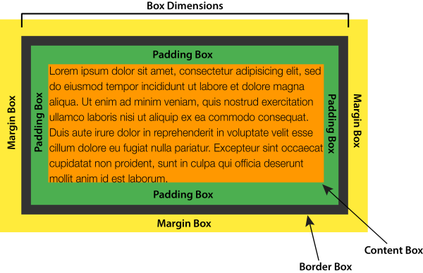
The CSS Box Model is a concept used to describe the layout and sizing of HTML elements. Each element contains a box for its content, padding, border, and margin. The boxes combine to determine an element’s layout of content as well as how adjacent elements appear alongside it:
Whether or not an element creates a box and which type of box it creates will depend on the markup language. CSS developed as a way to style HTML documents so, as a result, much of the CSS visual rendering model is rooted in HTML’s distinction between block-level and inline elements. By default, elements such as p and section create block-level boxes but a, span, and em create inline boxes. SVG, on the other hand, does not use the box model, so most layout-related CSS properties fail to work with SVG.
Block-level boxes create new blocks of content as can be seen in Figure 4.1. Block-level boxes are rendered vertically according to their source order and (except for tables) expand to fill the available width of their containing element. This is known as normal flow. Block-level boxes have a display value of block, list-item, table, or any of the table-* values (for example, table-cell).
Inline-level boxes, by contrast, do not form new blocks of content. Instead, these boxes make up the lines inside a block box. They’re displayed horizontally and fill the width of the containing box, wrapping across lines if necessary, as shown in Figure 4.2. Inline-level boxes have a display value of inline, inline-block, inline-table, or ruby.
But how are the dimensions of the box calculated? Here is where it becomes more complicated. As seen in Figure 4.3, box dimensions are the sum of the box’s content area, plus its padding width, and border width. The margin width creates a margin box for the element, and affects other elements in the document; however, the margin width has no effect on the dimensions of the box itself.
For instance, a p element with width: 300px, padding: 20px, and border: 10px has a calculated width of 360 pixels. That’s the sum of its width, left and right padding, and left and right border-width properties. To create an element that is 300 pixels wide with 20 pixels of padding and a 10 pixel border, the width needs to be 240px. Most leading browsers calculated the width in just this way.
Partly as a way to resolve competing models of browsers, the CSS working group introduced the box-sizing property. It lets us choose the box model implementation that we prefer, and greatly simplifies calculations when working with responsive designs.
Choosing a Box Model with box-sizing
The box-sizing property is defined in the CSS Basic User Interface Module Level 3 specification. It has two possible values: content-box and border-box.
Initially, the value of box-sizing is content-box. With this value, setting the width and height properties of an element affect the size of its content area. This matches the behavior defined by the CSS 2.1 specification, and it’s the default behavior in modern browsers (as presented in Figure 4.4).
Setting the value of box-sizing to border-box creates a little bit of magic. Now, the values of width and height will be applied to the outer border edge instead of the content area. Borders and padding are drawn inside the element box, matching the old Internet Explorer 5.5 behavior. Let’s look at an example that mixes percentage widths and px units for padding and borders:
<div class="wrapper">
<article>
<h2>This is a headline</h2>
<p>Lorem ipsum dolor sit amet, consectetur adipisicing ... </p>
</article>
<aside>
<h2>This is a secondary headline</h2>
<p>Lorem ipsum dolor sit amet, consectetur adipisicing ... </p>
</aside>
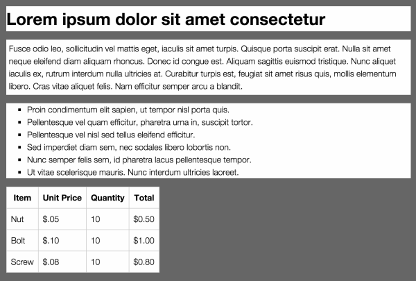
</div>Both our article and aside elements have the following CSS applied, which gives us the layout shown in Figure 4.5 where the first element has a width of 60% while the second has a width of 40%:
article, aside {
background: #FFEB3B;
border: 10px solid #9C27B0;
float: left;
padding: 10px;
}
article {
width: 60%;
}
aside {
width: 40%;
}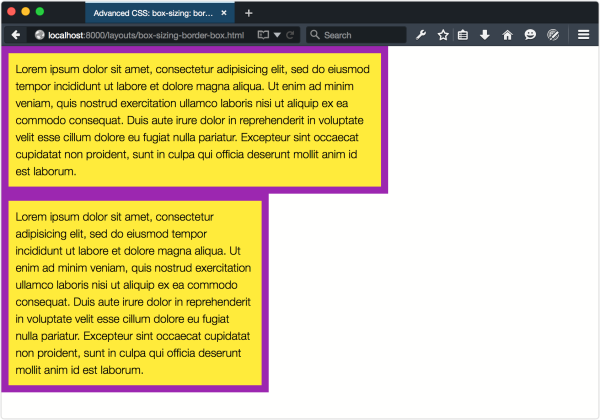
By default, both aside and article have a box-sizing value of content-box. The border-width and padding values add 40 pixels to the width of each element, which throws off the 60%/40% split considerably. Now let’s add box-sizing: border-box to the article and aside elements:
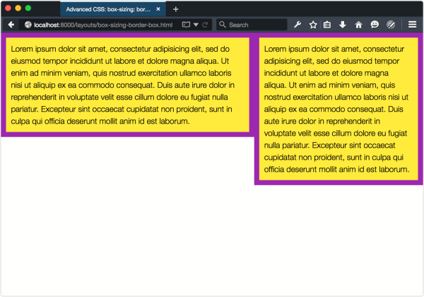
article, aside {
box-sizing: border-box;
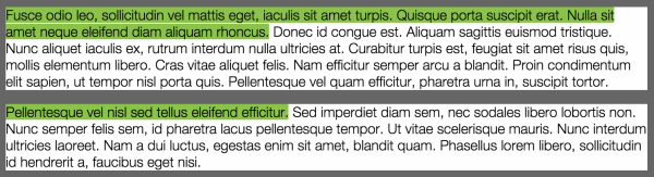
}You can see the change in Figure 4.6: the elements have the same width, but the box-sizing: border-box means that the width includes the border and padding. Because the width property applies to the border edge instead of the content area, our elements now fit side by side.
I’d suggest that you use box-sizing: border-box in your projects. It makes life easier, as there’s no need to calculate the width value to account for the values of padding and border, and boxes behave more predictably.
The best way to apply box-sizing: border-box is with reset rules. The following example is from Chris Coyier’s CSS-Tricks post, Inheriting box-sizing Probably Slightly Better Best-Practice:
html {
box-sizing: border-box;
}
*, *:before, *:after {
box-sizing: inherit;
}
This applies border-box sizing to every element by default, without affecting the box-sizing behavior of existing parts of your project. If you know that there will be no third-party or legacy components that rely on content-box behavior, you can simplify these rules:
*,
*:before,
*:after {
box-sizing: border-box;
}
Managing the box model is just one ingredient in understanding how to create complex layouts.
Frequently Asked Questions (FAQs) about the CSS Box Model
What is the significance of the CSS Box Model in web design?
The CSS Box Model is a fundamental concept in web design and development. It’s a box that wraps around every HTML element, and it consists of margins, borders, padding, and the actual content. The box model allows developers to place elements on the page and control their spacing and sizing. Understanding the box model is crucial for creating layouts with CSS, or for aligning items with other elements. It’s the basis of design on the Web.
How does padding differ from margin in the CSS Box Model?
Padding and margin are both parts of the CSS Box Model, but they serve different purposes. Padding is the space that’s inside the element border. It separates the border from the content within the element. On the other hand, margin is the space outside the border. It separates the element from other elements on the page. Both padding and margin are used to control the visual aspects of elements on a webpage, but they do so in slightly different ways.
How can I control the size of an element using the CSS Box Model?
The size of an element can be controlled using the width and height properties in CSS. However, it’s important to remember that these properties only set the width and height of the content area. To calculate the total width and height of an element, you must also add the padding, border, and margin. If you want to set an element’s total width and height explicitly, you can use the box-sizing property with the border-box value.
What is the box-sizing property in CSS?
The box-sizing property in CSS is used to alter the default CSS Box Model calculation. By default, the width and height of an element only include the content, and not the padding and border. However, if you set the box-sizing property to border-box, the padding and border are included in the element’s width and height. This can make it much easier to size elements.
How does the CSS Box Model affect the layout of a webpage?
The CSS Box Model plays a crucial role in the layout of a webpage. It determines how elements are sized and positioned and how they interact with each other. The box model’s properties – margin, border, padding, and content – can be manipulated to control the spacing, alignment, and overall layout of elements on the page. By understanding and using the box model effectively, you can create complex layouts with CSS.
What is the difference between block-level and inline boxes in the CSS Box Model?
In the CSS Box Model, elements are formatted as either block-level boxes or inline boxes. Block-level boxes, like divs and paragraphs, start on a new line and take up the full width available. Inline boxes, like spans and links, only take up as much width as necessary and do not start on a new line. The box model properties apply slightly differently to these two types of boxes.
How can I visualize the CSS Box Model while debugging?
Most modern browsers have developer tools that allow you to inspect an element and see its box model. For example, in Chrome, you can right-click an element and select “Inspect” to open the developer tools. In the “Elements” tab, you can see the box model for the selected element. This can be very helpful for debugging layout issues.
Can I use negative values for margin and padding in the CSS Box Model?
In the CSS Box Model, you can use negative values for margin, but not for padding. A negative margin can be used to overlap elements, but a negative padding would make no sense because padding is the space inside the border, separating it from the content.
How does the CSS Box Model work with responsive design?
The CSS Box Model is fundamental to responsive design. By using percentages instead of fixed units for the width, padding, and margin, you can create layouts that adapt to different screen sizes. The box model’s properties can also be adjusted using media queries to create different layouts for different devices.
What is the CSS3 box-sizing property and how does it affect the traditional CSS Box Model?
The CSS3 box-sizing property changes the way the width and height of elements are calculated. By default, the box-sizing property is set to content-box, and the width and height properties only include the content. If you set box-sizing to border-box, the width and height will include the content, padding, and border. This can make it easier to create flexible layouts, especially for responsive design.
Tiffany B. Brown is a freelance web developer and technical writer based in Los Angeles. Brown offers web development and consulting services to larger agencies and small businesses. A former member of the Opera Software developer relations team, Brown is also co-author of SitePoint's JumpStart HTML5 book. She sporadically writes about web development technology on her blog. You can follow her on Twitter at @webinista.


Published in
·automation·Debugging & Deployment·Development Environment·Libraries·Performance·PHP·Standards·Testing·September 7, 2016