Keep up to date on current trends and technologies
HTML & CSS - CSS

Making a Browser Based Game With Vanilla JS and CSS
Eoin McGrath
How to Apply CSS3 Transforms to Background Images
Craig Buckler

Bootstrap Card Component: a Complete Introduction
Ahmed Bouchefra

The CSS Reset Contradiction
Jens Oliver Meiert

Five Ways to Lazy Load Images for Better Website Performance
Maria Antonietta Perna
Creating Fluid Typography with the CSS clamp() Function
Daine Mawer
Quick Tip: How to Animate Text Gradients and Patterns in CSS
Ralph Mason
A Complete Guide to CSS Logical Properties, with Cheat Sheet
Ralph Mason

Quick Tip: How to Align Column Rows with CSS Subgrid
Ralph Mason
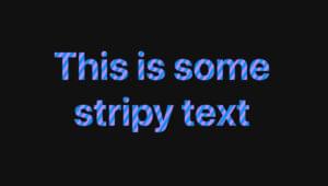
Quick Tip: How to Add Gradient Effects and Patterns to Text
Ralph Mason

Clean Architecture: Theming with Tailwind and CSS Variables
Emmanuel Onyeyaforo
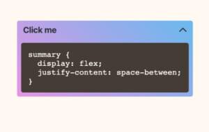
20 Simple Ways to Style the HTML details Element
Ralph Mason
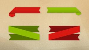
How to Create CSS Ribbon Shapes with a Single Element
Temani Afif

CSS Viewport Units: vh, vw, vmin, and vmax
Asha LaxmiMaria Antonietta Perna

How to Use the CSS gap Property
Ralph Mason
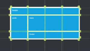
A Beginner’s Guide to CSS Grid Layout
Ralph Mason

How to Create a CSS Typewriter Effect for Your Website
Matt Nikonorov
An Overview of CSS Sizing Units
Tiffany Brown
How to Use the CSS Grid repeat() Function
Ralph Mason

How to Create Printer-friendly Pages with CSS
Craig Buckler
How to Use CSS aspect-ratio
Ralph Mason
How to Use CSS object-fit and object-position
Ralph Mason

An Introduction to Native CSS Nesting
Craig Buckler
How to Use CSS background-size and background-position
Ralph Mason

How to Center a Div Using CSS Grid
Fimber ElemuwaRalph Mason
How to Add a CSS Reveal Animation to Your Images
Temani Afif
Quick Tip: Shipping Resilient CSS Components
Stephanie Eckles
Responsive CSS Layout Grids without Media Queries
Stephanie Eckles

How to Create a Custom Range Slider Using CSS
Temani Afif

An Introduction to Container Queries in CSS
Stephanie Eckles

An Introduction to the :has() Selector in CSS
Stephanie Eckles

10 Ways to Hide Elements in CSS
Craig Buckler
Showing 32 of 368